Understanding the Statewide Dashboard
This dashboard displays statewide statistics based on the cases that fall into a selected Measure Group. Case totals and statistics displayed in this dashboard, however, are not displayed at the Measure Group level. A Measure Group represents a broader term for a series of subcategories, referred to as Measures, which are more precise representations of the types of cases that meet the Measure Group criteria. When a Measure Group is selected, the information displayed on this dashboard is the breakdown of cases that fall within the corresponding Measures and those that additionally meet the choices selected in the Leadership Roundtable, County, Include, and Case Category filters. Three separate measurement methods are used to display statistical results within this dashboard: |
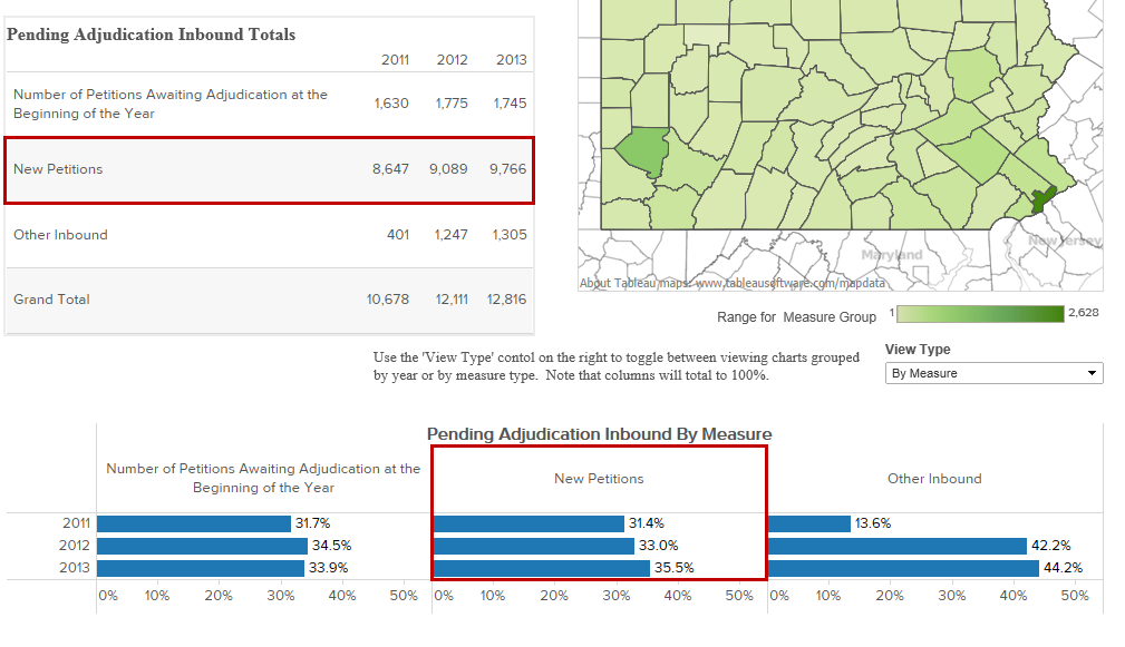
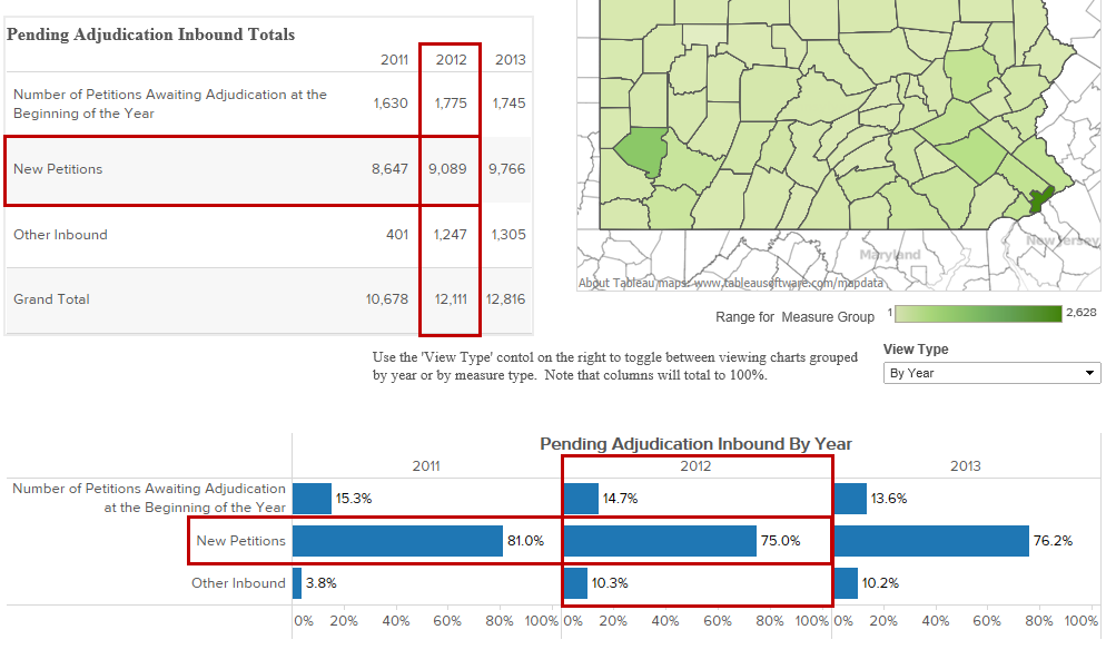
"Measure Group" Totals (table)* |
Based on the cases that fall under the selected Measure Group, this table shows the breakdown of cases, by calendar year, that are counted under each of the corresponding Measures.
*The name of this table varies based on the Measure Group selected through the corresponding data filter at the top of the screen (ex. Pending Adjudication Inbound Totals or Case Remaining in Inventory Totals).
|
"Measure Group Totals" by County (Map)** |
The map of Pennsylvania offers a more illustrative way of portraying the count of cases for each county within a given Measure. Various shades of green are used to reflect this count for the corresponding year. Lighter shades represent a smaller number of cases and darker shades represent counties with higher totals.
Hovering your mouse pointer over any county displays an informational popup that provides the county name, its county number, and its Leadership Roundtable. The precise Measure totals for a given year also display and these can be toggled for each county by clicking on the name of a Measure and/or year in the "Measure Group" Totals table. Initially, the statistics reflected on this map are for a pre-selected Measure and the most recent year available.
The shaded counties that appear in the map are based on the selections in the Leadership Roundtable and County filters at the top of the screen. For example, selecting ‘3’ from the Leadership Roundtable filter places a focus on the counties within that roundtable by removing the green shading from all counties outside that LRT. Alternatively, if the dashboard is restricted to Allegheny County through the County filter, only that county is shaded on the map.
**The name of this map varies based on the Measure Group selected through the corresponding data filter at the top of the screen (ex. Pending Adjudication Inbound Totals By County or Case Remaining in Inventory By County).
|
"Measure Group" By Measure or By Year (bar graph)*** |
This bar graph offers information in two ways based on the selection made through the View Type dropdown directly above:
By Measure: Based on the total number of cases that are counted under each Measure over all the years shown, this graph shows the percentage of those cases that correspond to each calendar year.
By Year: Based on the total number of cases that are counted under the selected Measure Group for a given year, this graph shows the percentage of cases that correspond to each Measure. The bar graph shows separate totals for a multi-year period.
***The name of this bar graph varies based on the Measure Group selected through the corresponding data filter at the top of the screen and the selected View Type (ex. Pending Adjudication Inbound Totals By Year or Case Remaining in Inventory By Measure).
|